ReCOVER
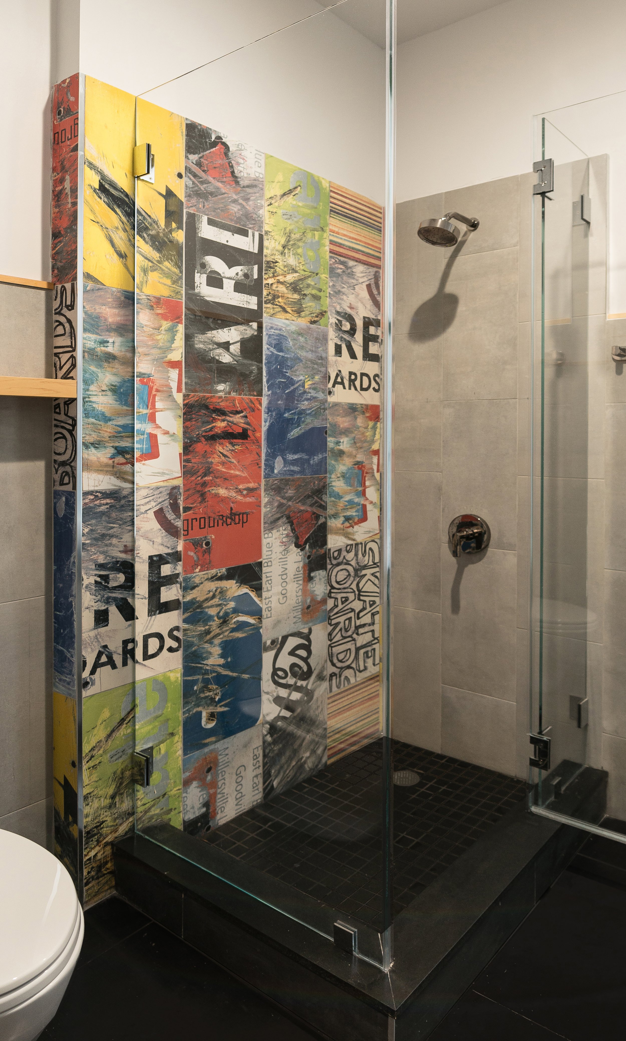
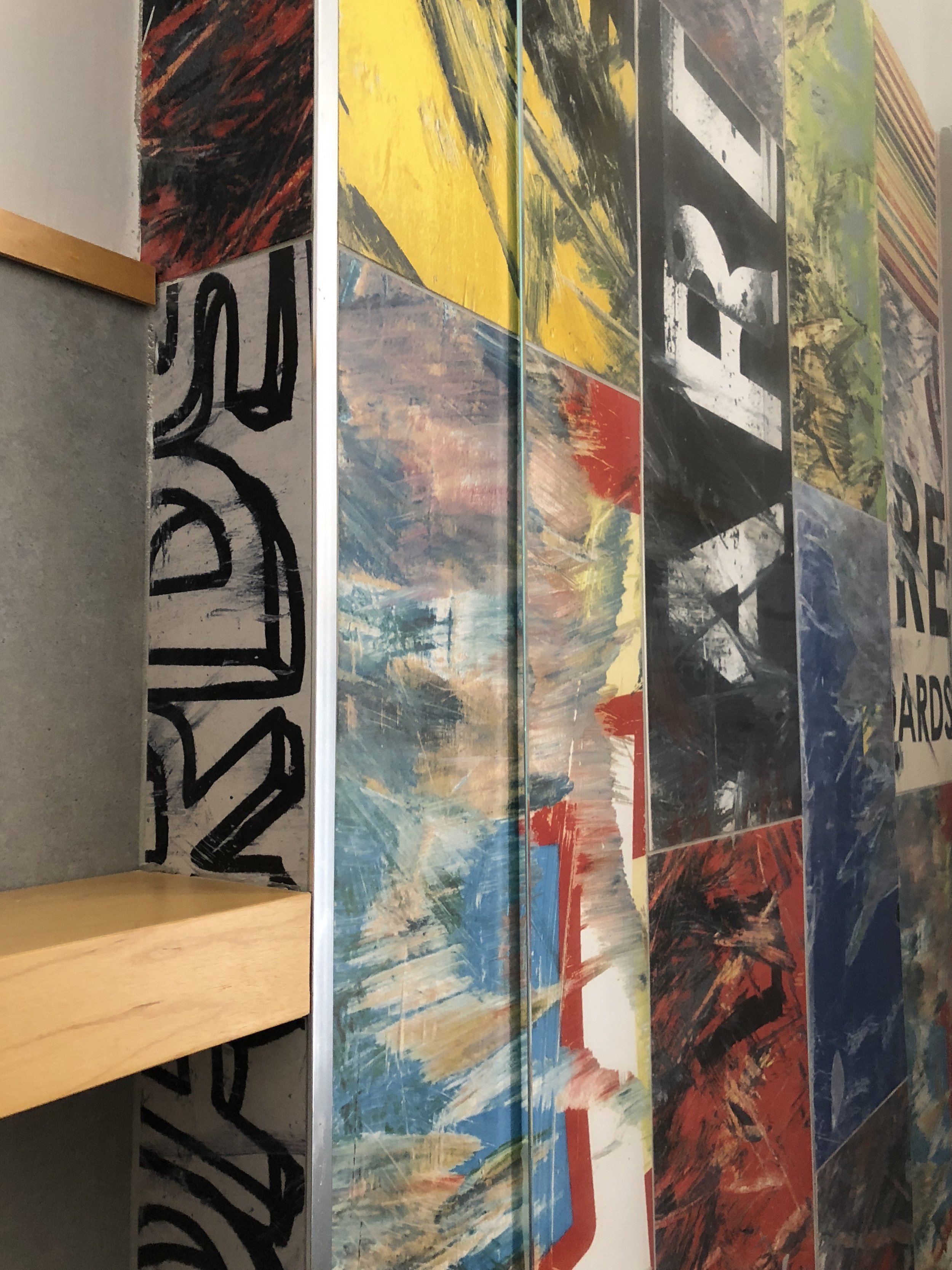
This technology-based recovery start-up engaged us to create a dynamic and energized studio that would establish the look and feel of the bespoke experience and their branding.
-
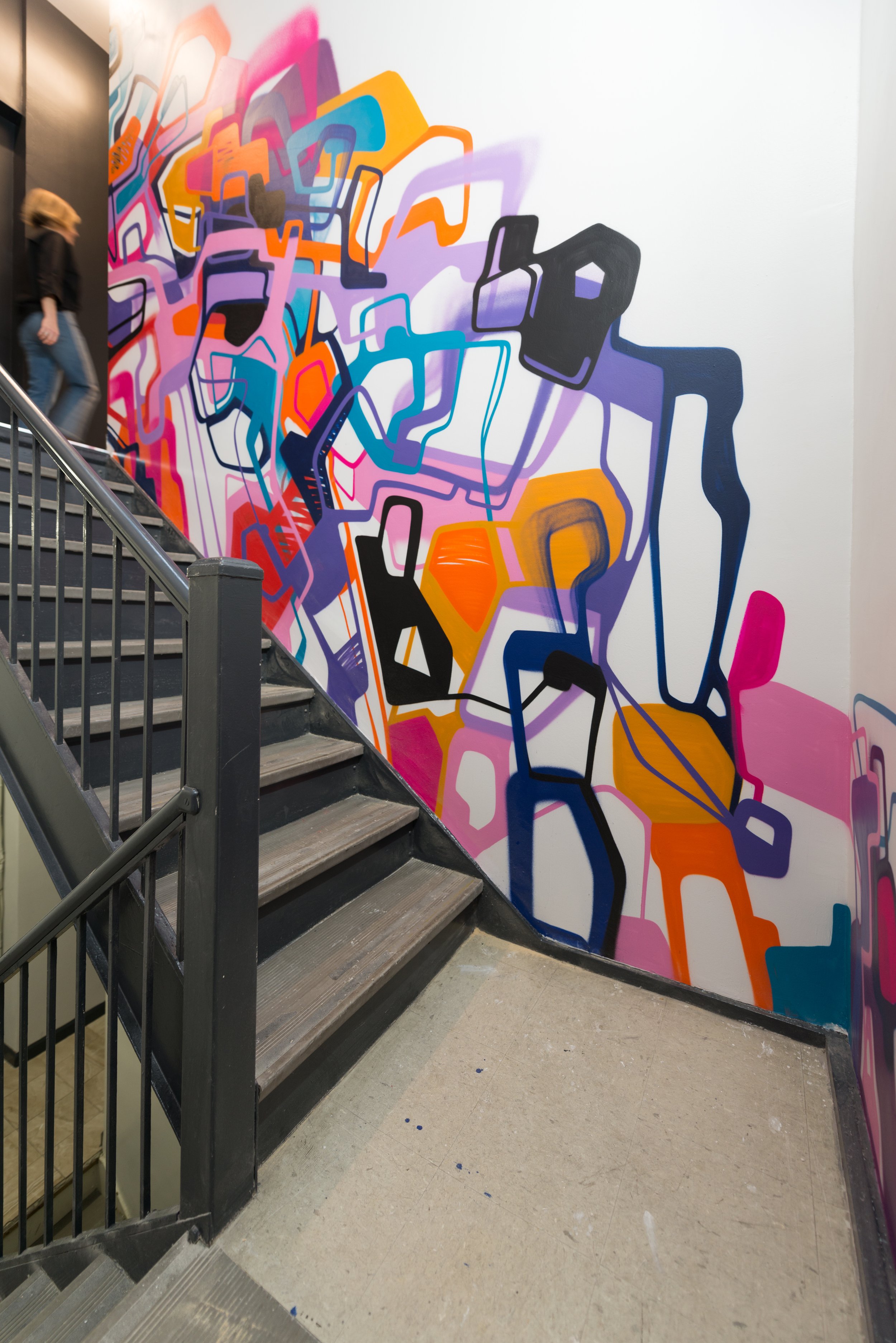
Method + Moxie researched each technology, examined the business plan, the competition, and the owner’s histories and personalities to inform the materiality and the design. The business is focused on recovery, so we centered the design on an age old and universal recovery tool – the tuning fork. It appears in the flooring design, the front desk, a railing and in a ceiling installation. The organic nature of the healing process is represented through custom graffiti cleverly showing cellular structures.
Our attention to detail and insistence on the workmanship delivering the intended design resulted in a cohesive space that represents the brand clearly to the clientele.


